An iOS app for finding and reviewing local coworking spaces.
This project was based on a design challenge from Bitesize UX, which provided the requirements of the example company, as well as basic research including user interviews.
The company (Postup) was a digital forum for freelancers and remote workers. In the initial scenario presented, recent forum posts had highlighted user difficulties in finding quiet locations to work, take phone calls, and meet with clients / coworkers.
PostUp specified that they wanted a mobile app solution for which they would charge a monthly fee. They owned no spaces themselves, so their intention was to help users find viable existing locations.
I engaged this design challenge using a modified 5-day Google Venture design sprint. Normally this process would involve the collaboration of an entire design team but for this project I acted as the sole designer.

Initial research canvassed individuals who worked at least partially remotely. The questions asked related to their experience, preferences, and process.


To select a location quickly and confidently, users would like to see:


I created an initial map to conceptualize the user’s core steps in achieving their goal (blue), along with possible secondary routes (red).

Before ideating, I did some initial research into existing platforms that addressed the same problem space, as well as unrelated platforms with potentially informative processes in place. The two most notable are below:
AirBNB:
This app excels at presenting local options in a succinct way, with comparable qualities (and visuals) presented upfront for easing browsing. Location photos, amenities, ratings, and prices are all available. Another useful feature is the ability to save locations to area-specific lists.

WorkFrom:
This website’s offering is very in-line with PostUp’s concept, offering reviews of remote-work-capable cafes near the user. Though the site has the core aspects of location review, they are presented in a bland and bare-bones manner, with a notable amount of scrolling required. The amount and quality of photos was also low.

I began the ideation process by focusing on a screen that would contain a baseline map and a location preview of some kind. I considered it to be the most critical screen, as it was the one that would convey the core location information to the user. While a deeper dive into a particular location was a possible step in the user’s process, the location-preview constituted a definite step.

I built out 2 preliminary design concepts centered on the ‘Map + Location Preview’ screen, but also included the screens that would come before and after.
Concept 1:
Once a location is tapped on the initial user-centered map, the location preview becomes partly visible at the screen bottom. Users can see initial information here and side-scroll through photos. An upward flick reveals the full location information; a downward flick would then return to the map.

Initial Map
Map + Location Preview
Expanded Location Information

I decided to move forward with Concept 2. Though the scrollable format (Concept 1) allowed for simpler navigation, I decided that the ability to compare multiple locations at a glance better served the user’s desire to select a location quickly. I did bring in some elements from Concept 1 including multiple images being visible on the same screen, to encourage quick scroll-though.
Starting with the 3 screens I had already sketched, I built out a larger storyboard including specific navigation elements.

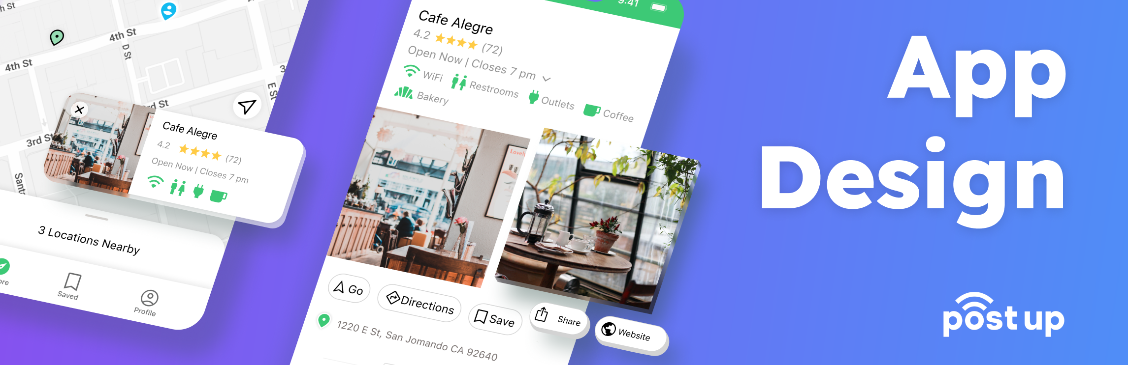
The Map Screen is the user’s starting point. It displays the user’s current position, a search bar to explore areas other than the current position, and nearby remote working locations.
The Location Modal appears when a location is tapped, displaying a photo, name, and core information.
The Nearby Locations Screen displays a list version of the locations visible on the Map Screen, tapping any of which leads to their Specific Location Screen.

The Specific Location Screen contains the core information as well as estimated busy-ness / occupancy and location reviews. There is an image carousel and 4 action buttons: Go (to Navigation Screen), Directions (for step-by-step instructions), Save, and Share.
The Navigation Screen displays the route to the location overlaid on the map. On the bottom of the screen is a button to switch between traveling modes (walking or driving), next to which is displayed the remaining distance to the location.
I created a high-fidelity prototype using Figma. I kept to to the outline from Day 3 but chose to add a Directions screen as well, as I decided that that functionality would be natural and necessary to the user’s process.
Below are the final prototype screens:

I conducted remote user testing with 5 individuals, all of whom worked at least partly remotely. During these sessions I collected background information and had the interviewees work through tasks in the prototype. They also provided their general impressions and spoke to their expectations for this type of app.
Much of the design worked well but, as always, feedback from actual users revealed multiple ways to improve and enhance the offering.


Reviews were consistently important to user’s decision-making; however, the location of the reviews was not always apparent. The initial star rating can be linked to bring the user to the relevant section, which can also be moved further up the screen.
.png)

Several users wanted to know if purchase was required to use a location’s WiFi. A new icon could be added to the amenity section to address this.

Some users misinterpreted the ‘Directions’ button to refer to the active navigation to the location, as opposed to the list of steps to travel there. Revised wording might provide clarity.


Users were unsure which direction they were facing on the map. A direction-facing indicator could be added to the user’s position marker, as well as compass-orientation.

There were several mentions that having the location names visible on the initial map (without tapping) would be helpful for assessing an area at a glance.

The amenity icons were not always clear to users (specifically those for ‘restroom’, ‘quiet’, ‘not crowded’, and ‘bakery’). It may be worthwhile to provide the icon labels earlier in the task flow.