Centry

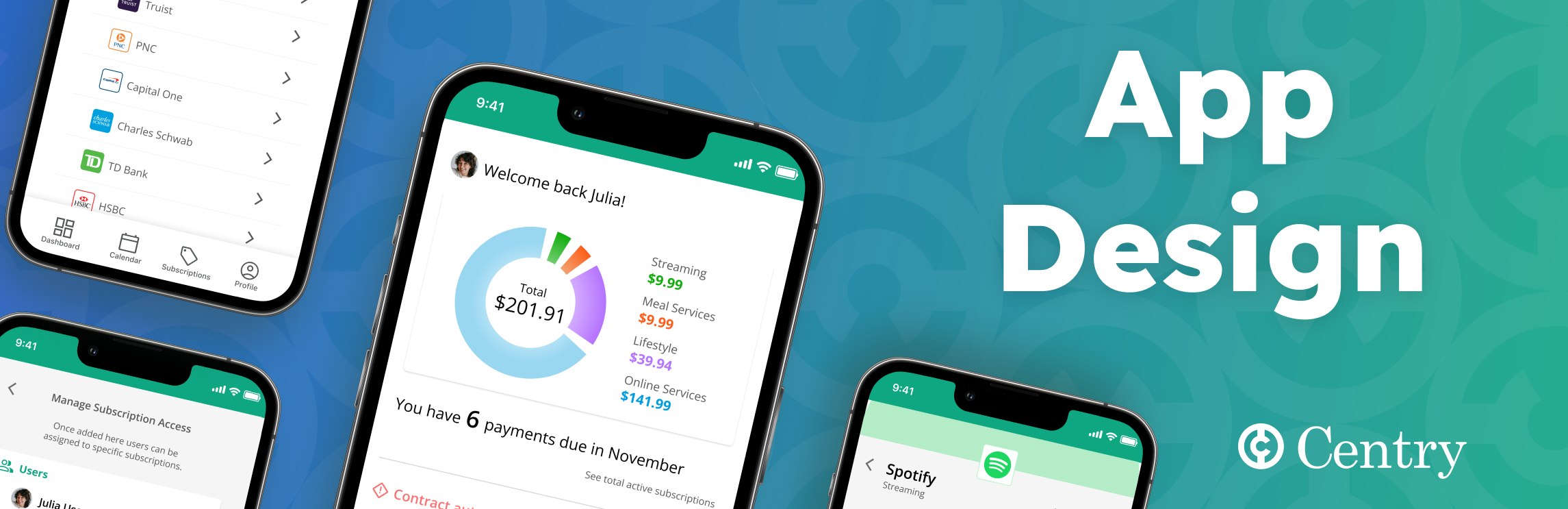
A subscription-tracking app for iOS featuring account access management.

What

Why

Category

Mobile App (iOS)
Portfolio Project
Money Management

Role

Timeline

Tools

UX/UI Designer
UX Researcher
Nov - Dec 2022
Figma
Market Research
Competitive Analysis
User Surveys
User Interviews
Affinity Maps
Personas
Red Routes
Usability Study
Paper Sketches
Wireframes
Wire Flows
Prototype

Introduction

The Problem

As of 2022, a significant portion of companies are moving toward subscription-based business models. Renewal notifications in such models are easily missed, leaving the customer paying for things they no longer want or need.

The goal of this project was to produce a mobile-based service to track user subscriptions for goods and services.

The Solution

I designed the Centry app to take the effort out of tracking recurring payments:

Research

Secondary Research

I conducted open-source research to better understand consumer habits and preferences, as well as the solutions currently available. Below are some key insights:

72%

Removing themselves from the payment approval process has become the consumer default.

of consumers have all subscriptions set to auto-pay

The younger generation is significantly more likely to forget about subscriptions and still pay for them.

Competitive Analysis

I conducted a screen-by-screen analysis of the top-3 services in the subscription tracking space: TrackMySubs (website), Trim (app), and Rocket Money (App), as well as a UI analysis of top performers including Intuit Mint, Goodbudget Budget Planner, Quickbooks Accounting, Expensify, and Nerdwallet. Rocket Money was the clear frontrunner in terms of clarity of design and providing key information upfront.

Surveys

I gathered responses from 32 survey respondents:

There is broad frustration over needless paying (and systems designed to exploit consumers into doing so).

had paid for services they no longer wanted or needed

The clear majority (66.7%) use some kind of solution to attempt to monitor their subscriptions.

User Interviews

Of the 32 respondents from the screener surveys I conducted remote interviews with five which helped to identify their greatest concerns in the problem space. Below are some key quotes:

Affinity Maps

I organized key points from the interviews into groupings; the final categories were:

Interest in service
Concerns / Worries
Account entry preference
Wants
Finance-sharing
Notification preference
Tracking method
Cancellation service

User Persona

User Stories

"How Might We..."

...help users to understand their recurring financial obligations?"

...make it easier to evaluate the cost of subscriptions over time?"

...reduce the time needed to unsubscribe from services?”

Define & Ideate

Initial Ideation

Based on the research done up to this point I compiled ideas around the services to be incorporated and notes on user concerns and preferences. I also included design notes on what is and isn’t working well with existing offerings.

Site Map and Red Routes

The initial ideation session gave me a sense of how the app could be organized, which I put into an initial site map:

The site map was the starting point from which I began building out the 3 primary Red Routes - the most critical user flows. During this process I iterated on different arrangements of the screen functions, decision points, and data-entry points.

Prototype & Test

Paper Sketches

Low-Fidelity Wireframes

At this point I began transferring the sketch concepts to Figma and further developing the architecture and navigation.

Wire Flows

Using the Low-Fidelity Wireframes I designed Wire Flows, visually depicting the navigational structure of the app and the relationships between screens.

Low-Fidelity Usability Testing

I conducted the first round of moderated remote Usability Testing with 5 users, documenting their actions and recorded their shared observations. Multiple point of difficulty or confusion were identified and subsequently addressed. The Top-2 takeaways are below:

1. Smart Algorithm Screen
Issue: Each subscription suggestion included its own  ‘Edit’ and ‘Delete’ buttons. Users reported that this made the screen feel too busy. The prominence of the ‘Delete’ option also felt intimidating (users were concerned about making a permanent mistake).
Solution: The original buttons were replaced with a single ‘Edit Selections’ button below the subscriptions section. The follow-on edit menu contains the ability to delete. This reduces the upfront burden of choice without reducing the user’s ability to edit.
2. Dashboard Screen
Issue: The upper section of the dashboard was overwhelming the users. They were unsure which numbers were important to consider and wanted a simpler presentation overall.
Solution: I reduced the numbers displayed to show only the amount owed (total and by category) and the number of payments due in the current month. I separated the information using a white card and color-coded the spending categories to illustrate a clear connection to the donut graph (representing total spending).

Design System

The design was based off the brand personality of ‘a trusted friend who is helping you save money’ and the brand attributes of being trustworthy, caring, friendly, and casual.

I used an 8px grid as the basis for the app. 4px deviations were used for the bounding boxes and in margin areas.

High-Fidelity Design

Using the design system I'd put together I built out the app in high-fidelity in Figma. I incorporated the lessons learned from the first round of testing and then prepared to conduct another round with the new, updated design.

High-Fidelity Usability Testing: 

To finalize the design I conducted another round of moderated remote user testing, identifying issues and enacting improvements after each round. The top-3 improvmeents are below:

1. Cancel Function
Issue: Users feel the ability to cancel is too prominent, and are concerned that they may irreversibly cancel their subscriptions by accident.
Solution: The Cancel button was relocated to the bottom of the Edit Account screen. Once tapped, a modal requires confirmation, after which the user is prompted to type the word ‘cancel’. This additional layer of security prevents inadvertent taps from cancelling services.
2. Individual Subscription Screen
Issue: The presence of the ‘Payment History’ information was taking up a significant amount of space on the screen, which users took to be cluttering without providing concrete benefit.
Solution: I kept the information accessible in the same location, but modified it to being an expandable section. In this modified version it remains accessible when desired, but allows for the core information to be presented on a single screen without scrolling.
3. Manage User Access Screen
Issue: The user was able to add users to the app but was unsure which accounts each user had access to.
Solution: I added mini-logos indicating each subscription to which an individual user had access. Tapping ‘Edit User Access’ expands each user’s section so that access can be changed from a central location without navigating to the specific account.

Try the final prototype!

Lessons Learned

Safeguards are key to reducing anxiety
When users feel that they can easily make irreversible mistakes it causes them anxiety. Requiring additional intentionality will lengthen the user’s time to task completion, but that is a worthy trade-off if it increases the user’s sense of overall comfort.
Simplicity must balance with thoroughness
It’s important to ensure that the user is not burdened with too much information to process. At the same time, whenever possible they need to be provided with enough that they are not required to remember or deduce.
Presentation needs to tell a story
The organization of information has to be laid out as a path the user will travel. Conscious information hierarchy is vital to addressing the user’s priorities and concerns.
See more of my work