A UX audit and redesign conducted for an online accounting platform providing bookkeeping, tax, and CFO services.
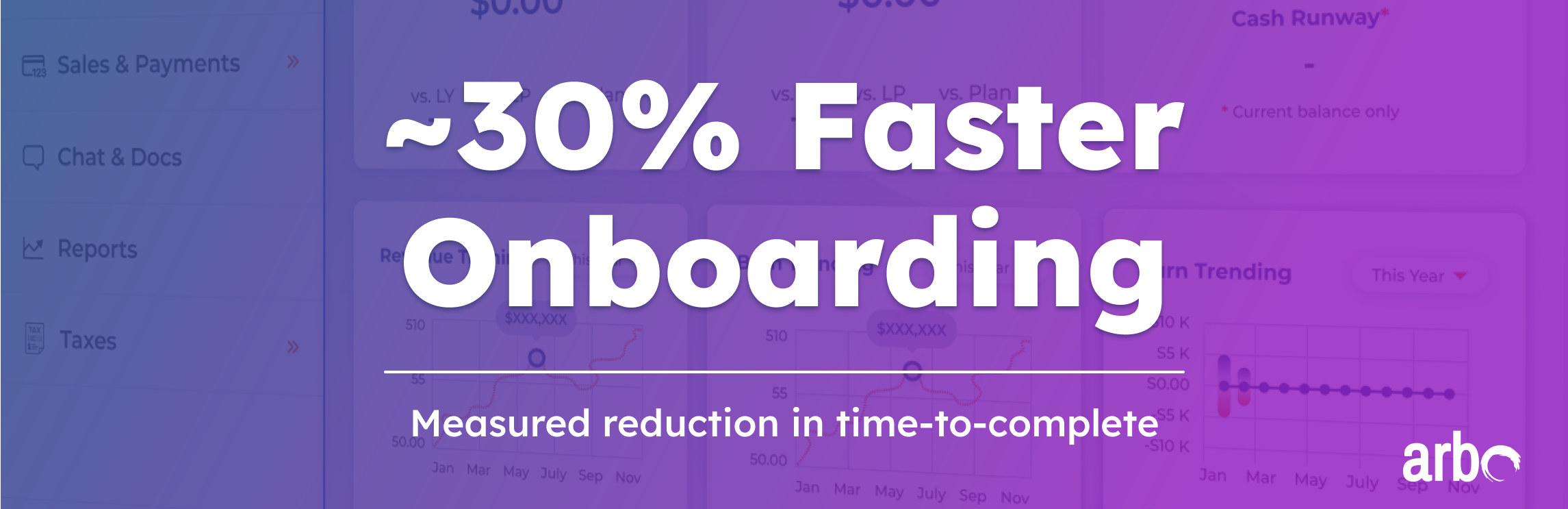
Arbo was an accounting SAAS focused on growing start-ups. Their CEO recognized that their personally-facilitated onboarding process was causing a major scalability issue leading to the loss of prospects and potential revenue. To address this I implemented a self-serving onboarding experience that resulted in ~30% faster onboarding time-to-completion, allowing Arbo to continue to scale efficiently.
To maximize efficiency I had each teammate conduct research in 1 of 3 areas: Business segment research, competitive research, and initial analysis of the Arbo platform. The business segment portion was important to help the team as a whole become more familiar with the general operating space and to make more informed design decisions. The other two areas are referenced below:
I focused my research on the core competitors that were identified in initial conversations with the client. I analyzed 4 current offerings to better understand what users were accustomed to and would be expecting from the platform. This aspect of the research was also critical to develop a sense of the UI norms in the accounting SaaS field.
The team then began looking at Arbo itself. Another team member and I created maps of the user flow to gain clarity on all of the user’s options and requirements. We also began identifying initial areas for improvement.


During the initial review we conducted an assessment of colors and contrasts being used on the platform. In multiple places we discovered the design fell short of WCAG requirements. We would go on to address all contrast issues in the high-fidelity stage.

The team conducted remote user testing and interview sessions with 5 small business owners, having them sign-up for the platform as though they were enrolling their businesses. This provided a wealth of information on the actual user experience, issues, and preferences.
I compiled the notes from all 5 interviews into visual annotations on a screen-by-screen walkthrough of the user flow, to help the design team (and client) discuss the issues identified and potential solutions.


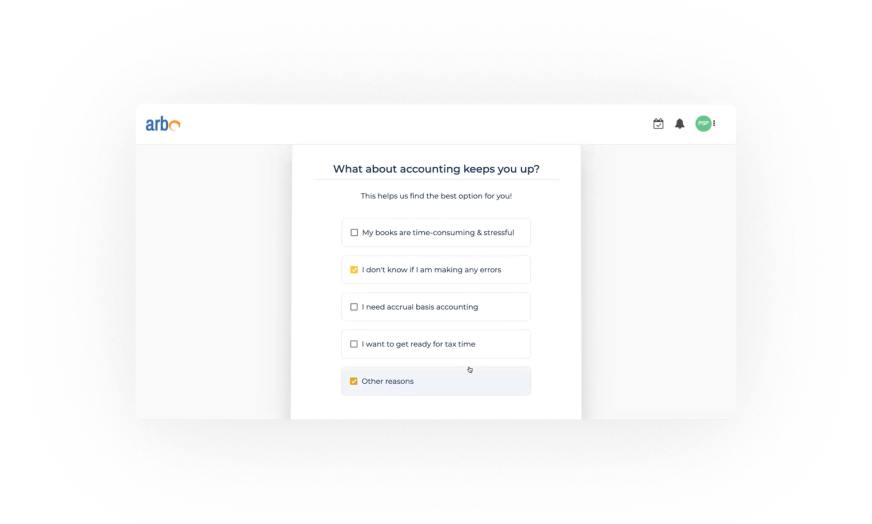
Based on the findings we identified multiple areas of focus for the design effort. These included:

The team collaboratively built wireframes based on the sketch concept. This phase was vital for identifying potential issues with the re-design, as well as for discussing and demonstrating different design options.


During the wireframe iteration process I discovered that the service options (and fee structures) available to customers were more complicated than the team had understood based on our initial conversations with the client. The initial sign-up process requested financial information from the user without being clear on exactly what they were committing to, what they were getting access to, and for how long, and as such created a barrier to entry. I followed up with the client with targeted questions and used the results to map out a revised model for the team:


With the client’s agreement on the revised user flow the team moved forward with finalizing the overall design. Below is a walk-through of the prototype with high-fidelity screens:

The final design simplified the presentation to reduce any distraction and keep the user traveling down a single clear path. A subtle wave motif is used in the background on each screen, creating a consistent visual feel. Our solution is designed to get the user onto the platform as fast as possible, and to that end the flow has been reduced from 10-12 screens in the original down to 8 in the revised version.

We managed to reducing the total number of steps while also adding several orientation screens. Early testing had shown that users were confused when first arriving on the platform, so I created a solution using modals to provide guidance on several key points.
For example: In the screen below I used the first modal to draw attention to the ‘account status’ section I created in the upper-right. This shows the user’s status as being enrolled in the Free Plan, and makes it clear how they can upgrade their account. This upgrade-deferment innovation is what allowed us to reduce the platform’s initial information requirements and shorten the flow overall.

We conducted an additional round of remote user tests (5) on the final prototype. The process was clearly demonstrated to be faster and there were no major areas of confusion for the user. The overall user reaction was very positive, and several commented on being pleasantly surprised to have gotten through the process so quickly.
Still, based on user feedback we were able to improve several aspects of the design:


During the course of the project I came up with several suggestions that fell outside the scope of the immediate project. I provided them in the final deliverable as additional ideas to keep in mind moving forward, to provide extra value to the client.
The current design clearly states the password requirements, but Arbo may want a more explicit password entry process. Though not strictly necessary, visually demonstrating when password requirements are met could eliminate any possibility for confusion. In the example below green check marks are used for this purpose. An alternate version of this concept would include red-X icons to provide negative confirmation when a requirement has not been met.

The current design uses input fields with dynamic titles, meaning that the section title appears within the input box until the user clicks to enter information, after which a smaller version of the title appears within the upper border of the field. Entered text appears darker than the previous title text. This design is clean, simple, and indicates at-a-glance what information has already been entered.
An alternative, less development-heavy option is shown below. In this option the input fields are non-dynamic. The titles are shown in small text above the input fields, which themselves remain blank until the user enters their information. The first design is the better of the two, but if development time is limited this second option is also viable.

The orientation section of the Sign Up process serves to prevent user confusion, but it is only experienced once. A ‘Help’ button places in the upper navigation could serve as a helpful and reassuring reference for users, particularly those who are onboarding themselves. This section could include a full orientation for the dashboard as well as explanation of how the user can accomplish specific tasks and engage specific services.

I wanted to ensure that the final deliverable was self-contained and easy to understand. Along with the final prototype I submitted project notes covering all the key aspects of the project, including the style guide, components, notes on design decisions, and additional options.